SAPNDA
Contributing components to the DNA Web UI Kit
The DNA Web UI Kit is the shared Figma library designers use across SAP Business Data Cloud (BDC), SAP Analytics Cloud (SAC), and Datasphere (DSP). Working with the design system team, I designed, rebuilt, and documented components for the kit, focusing on consistency across products and on making components flexible enough that designers don't need to detach them. I also helped the team start building from the kit with Claude. This project is under NDA, so details shared here are intentionally high-level.
my role
One UI kit behind three products. Every gap shows up everywhere.
The DNA Web UI Kit is its own kit within SAP, built on the Fiori guidelines and UI5 component library. SAC, Datasphere, and Business Data Cloud are all designed with it. Our design organization has more than 165 designers across eight countries. When a component is missing, inconsistent, or too rigid, designers on each product work around it in their own way, and the products drift apart.
I spent six months on the design system team, working alongside the kit owners. Each contribution followed the same path: gathering requirements, designing, writing the spec, reviewing it with the kit owners, and documenting it for designers.
what i worked on
Four components, a few smaller additions, and helping the team build with Claude.
- Creation Item// ComponentUnified into one spec across three products
- Page Switcher// ComponentReplaced custom pagination with a kit subcomponent
- Switch Group// ComponentRebuilt with slots so designers stop detaching it
- System Information Bar// ComponentMoved hard-coded colors onto theming tokens
- App Start Page and chart icons// Smaller additionA page template and new chart icons
- Claude enablement// AI workflowA setup video, a workshop, and a Quick Start Guide
creation item
The same tiles, one spec across three products.
Creation items are the large "Create" tiles users see when starting something new. BDC's version used different color tokens and corner radius from SAC and Datasphere's, so the same component looked different depending on the product.
I rebuilt the base set so all three products share one spec, with the same tokens, a 16px corner radius, BDC variants, and accessibility annotations. Two questions came up along the way. On color, I learned the item colors are chosen to stand apart at a glance, not to look harmonious, so I wrote rules for assigning them into the guidance. On keyboard navigation, UI5 and the Fiori keyboard guidelines disagreed on what the up and down arrows should do. I raised it with the DNA accessibility advocates, and we landed on left and right moving through items in order, with up and down moving between rows.
I also wrote the usage documentation, covering when to use it, anatomy, accessibility labels, and color rules. It recommends putting "Create" inside each label, as BDC does, so screen reader users know what each item does as they tab through.
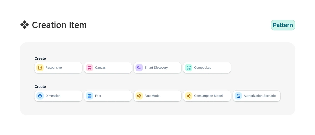
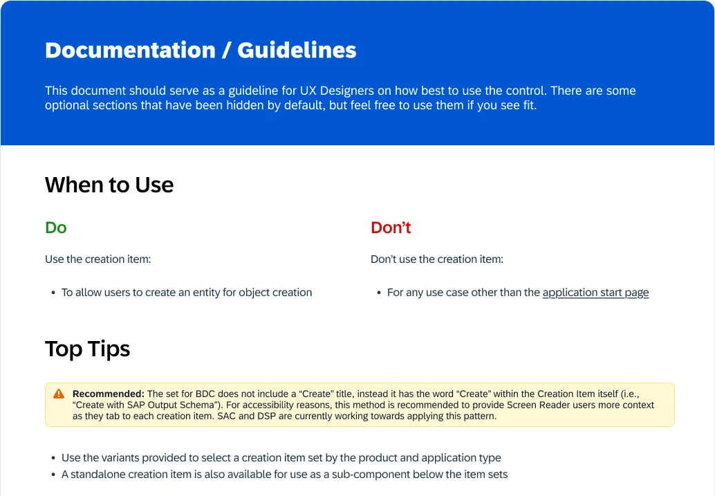
Part of the usage documentation
page switcher
Deciding whether to build at all.
Some toolbars had their own custom pagination that wasn't part of the design system, so each product handled paging differently.
Before designing anything, I collected every instance across the products and asked the kit owners whether designers should reuse the existing pagination component or whether the kit needed something new. We agreed on a Page Switcher subcomponent, which I designed and documented, including rules like disabling the left arrow on the first page. It shipped in v1.3 of the kit.
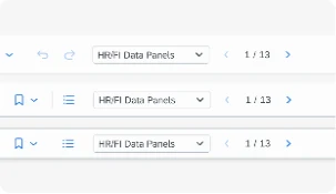
Page Switcher in the app toolbar
switch group
Designing so designers don't detach.
The Switch Group couldn't hold more switches, so designers detached it whenever they needed more. Detaching breaks the link to the library, so future updates pass those copies by.
I rebuilt it with slots so a group can hold more switches, and added a guideline showing how to extend it without detaching. The new Switch Group shipped in v1.3 of the kit.
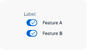
Switch Group, rebuilt with slots
system information bar
From hard-coded colors to theming tokens.
The System Information Bar tells users which system they're in, such as test, development, or production, with a color customers can choose. In both SAC and Datasphere those colors were hard-coded hex values, so they didn't follow the theme and fell short of SAP's consistency standards.
I mapped every bar color to a theming token and presented the old hex approach next to the new one. The same colors carry through to the browser tab icon, so the tab and the bar always match. I also worked with the user assistance team on the label wording, and once the spec was approved, the component was added to the DNA Web UI Kit.
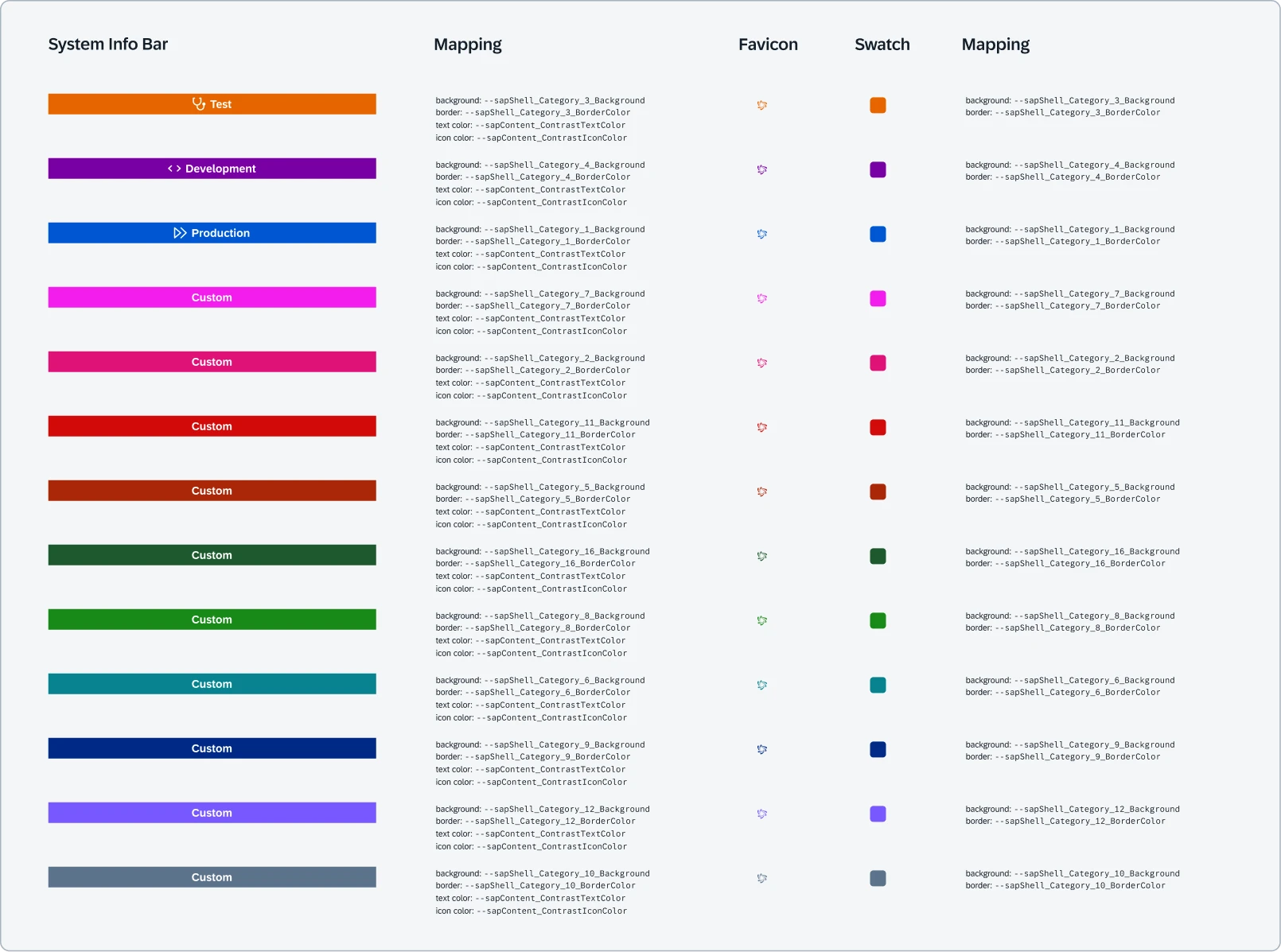
Every bar color mapped to a theming variable
smaller contributions
A page template and new chart icons.
I also rebuilt the BDC App Start Page from SAC components, with interchangeable table and toolbar subcomponents, and designed new chart icons, including a sunburst chart, stream graph, and word cloud.
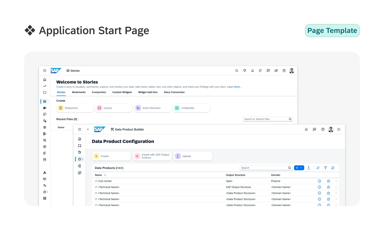
BDC App Start Page, rebuilt from SAC components
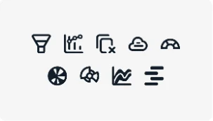
New chart icons
ai workflow
Helping the team build from the kit with Claude.
Alongside the components, I explored how designers could use Claude with Figma to build from the DNA Web UI Kit, noting down which prompts and setups produced consistent results.
Claude Code and Figma MCP setup video
Ahead of the workshop, I screen-recorded the entire installation from start to finish, then edited it into a setup video designers could follow along with on their own machines. The goal was for everyone to arrive with Claude already installed and connected to Figma. The video was shared with our design team and with designers on another team, and the feedback from both was positive.
Claude x Figma workshop
In April 2026, I co-ran a Claude Code x Figma workshop, "From Prompt to Prototype," for 20 to 30 designers, both in person and online. The session covered how Claude connects to tools like Figma through MCP, basic prompting techniques, a hands-on design challenge, and best practices, followed by an open discussion. Not everyone had set up beforehand, so we took time out of the session to help them install it. I helped prepare the agenda, recorded the session, and edited the recording so the team could rewatch it.
The workshop also traveled. SAP's Design Hub in Walldorf, Germany adopted it and ran it three more times in May and June 2026 for designers across teams. Nearly every registered participant attended each session, every session had a waiting list, and colleagues at other locations asked for sessions of their own.
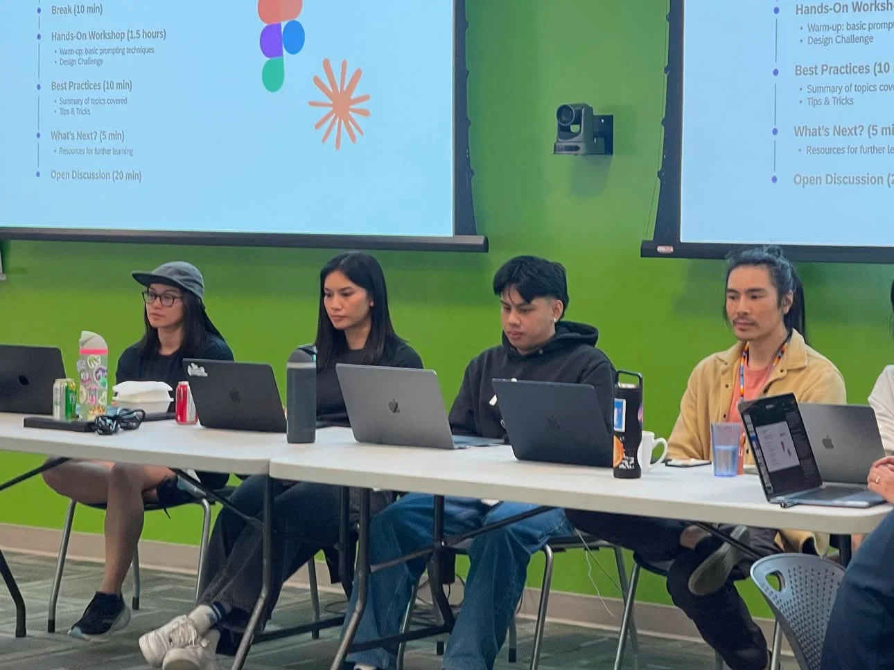
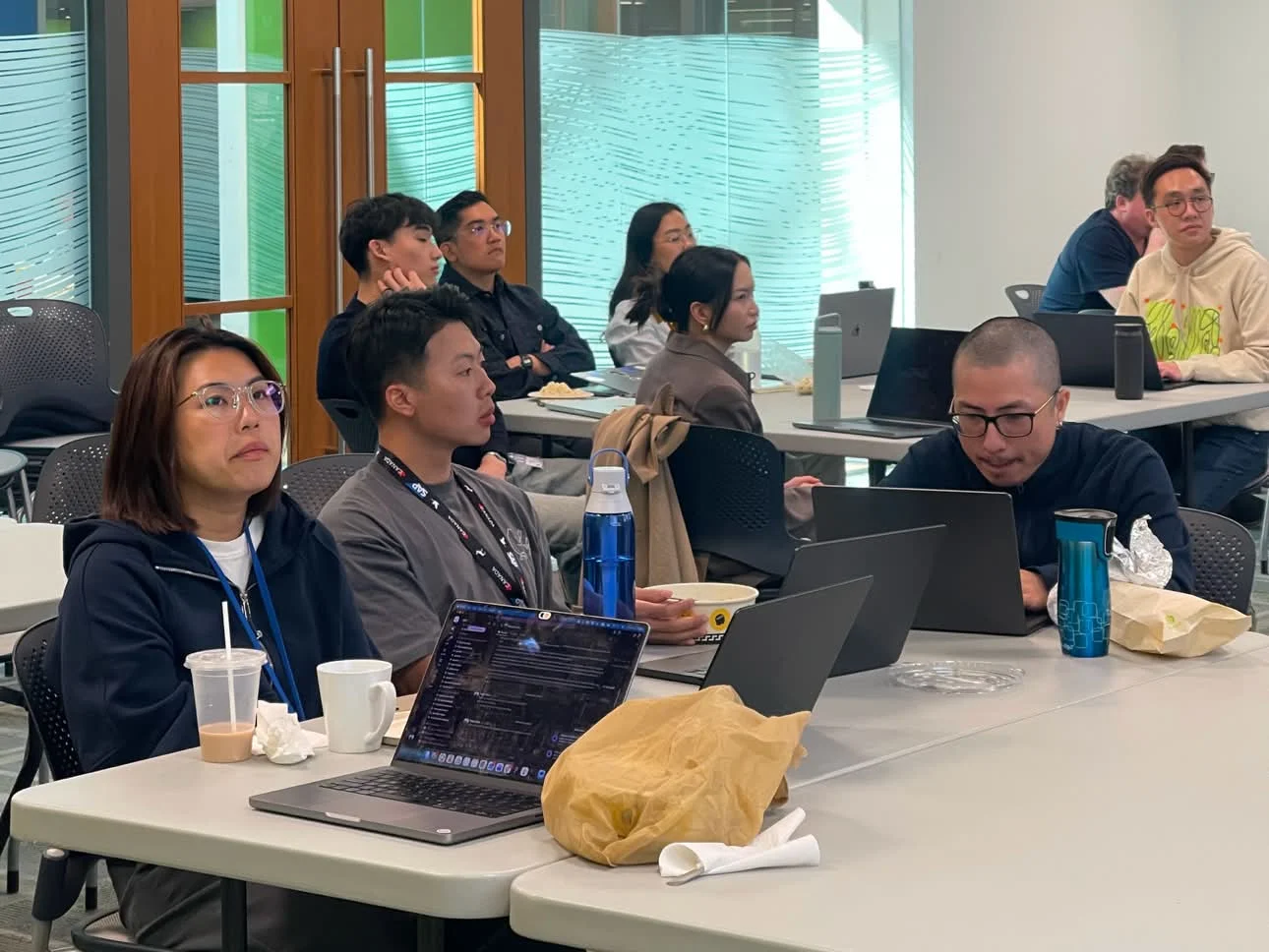
From Prompt to Prototype: Claude Code x Figma
Claude DNA Quick Start Guide
After the workshop, three of us wrote a Quick Start Guide that takes designers from installing Claude to their first working session in five steps. I focused on the first two: what you'll set up, and running the setup script. It sits alongside beginner guides on the terminal, Claude Code, and MCP servers.
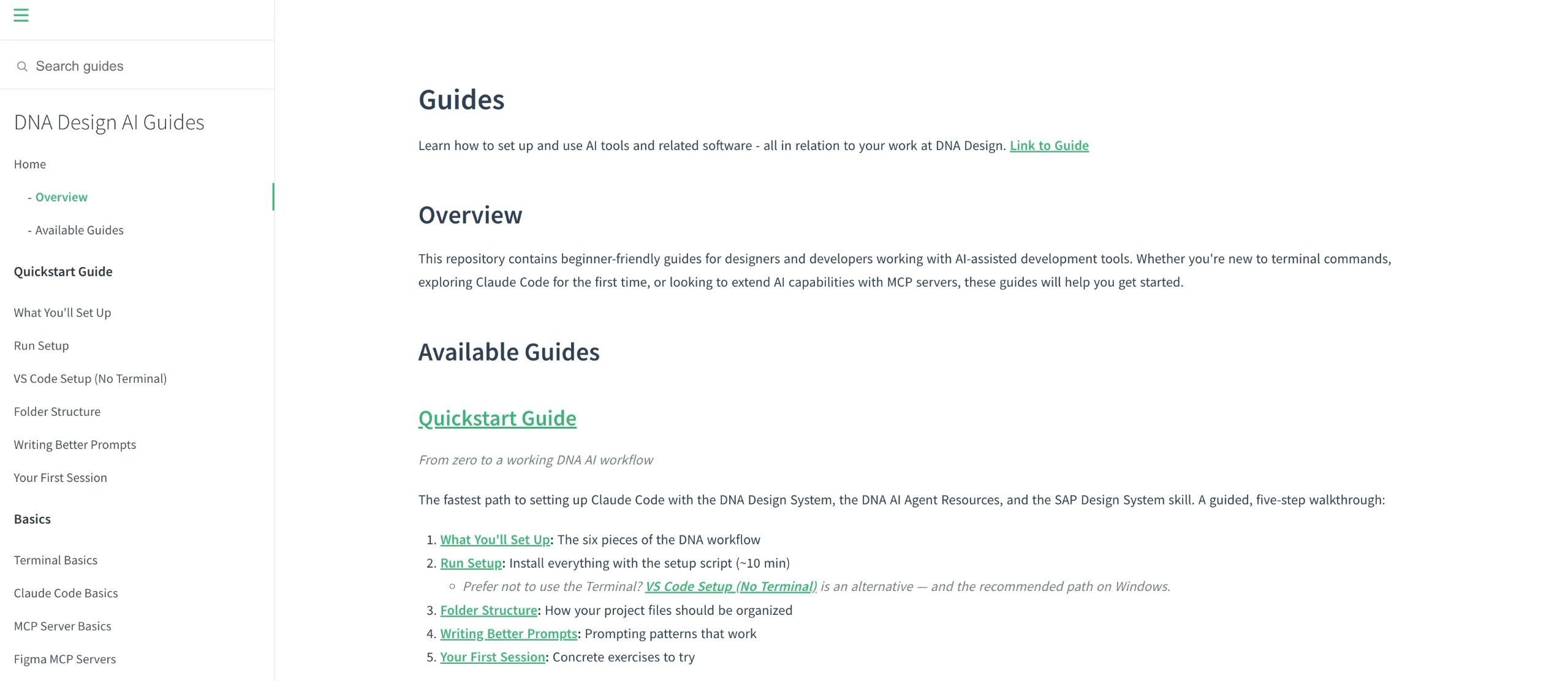
outcome
Six contributions to the kit, shared across three products.
Creation Item, Page Switcher, Switch Group, App Start Page, System Information Bar, and a set of chart icons, each specced and documented for designers across SAC, Datasphere, and BDC. Page Switcher and Switch Group shipped in v1.3 of the kit. Alongside the components, I made a setup video, co-ran a workshop for 20 to 30 designers that SAP's Design Hub in Walldorf went on to run three more times, and helped write a Quick Start Guide for building from the kit with Claude.
reflections
Designing for designers
My users on this project were other designers. A component that technically works but gets detached has failed, so I started asking "what will someone need to change here?" before deciding on properties, variants, and slots.
Hybrid sessions split your attention
People joining online ran into setup issues too, but stopping the workshop to help them meant pausing for everyone in the room. It was hard to support both groups at once. For future hybrid sessions, I'd have one facilitator dedicated to the online attendees.
Consistency comes from the spec, not the screenshot
Two components can look nearly identical and still drift apart over time if they use different tokens underneath. Aligning tokens, corner radius, and naming was less visible than a redesign, but it's what keeps three products in sync.